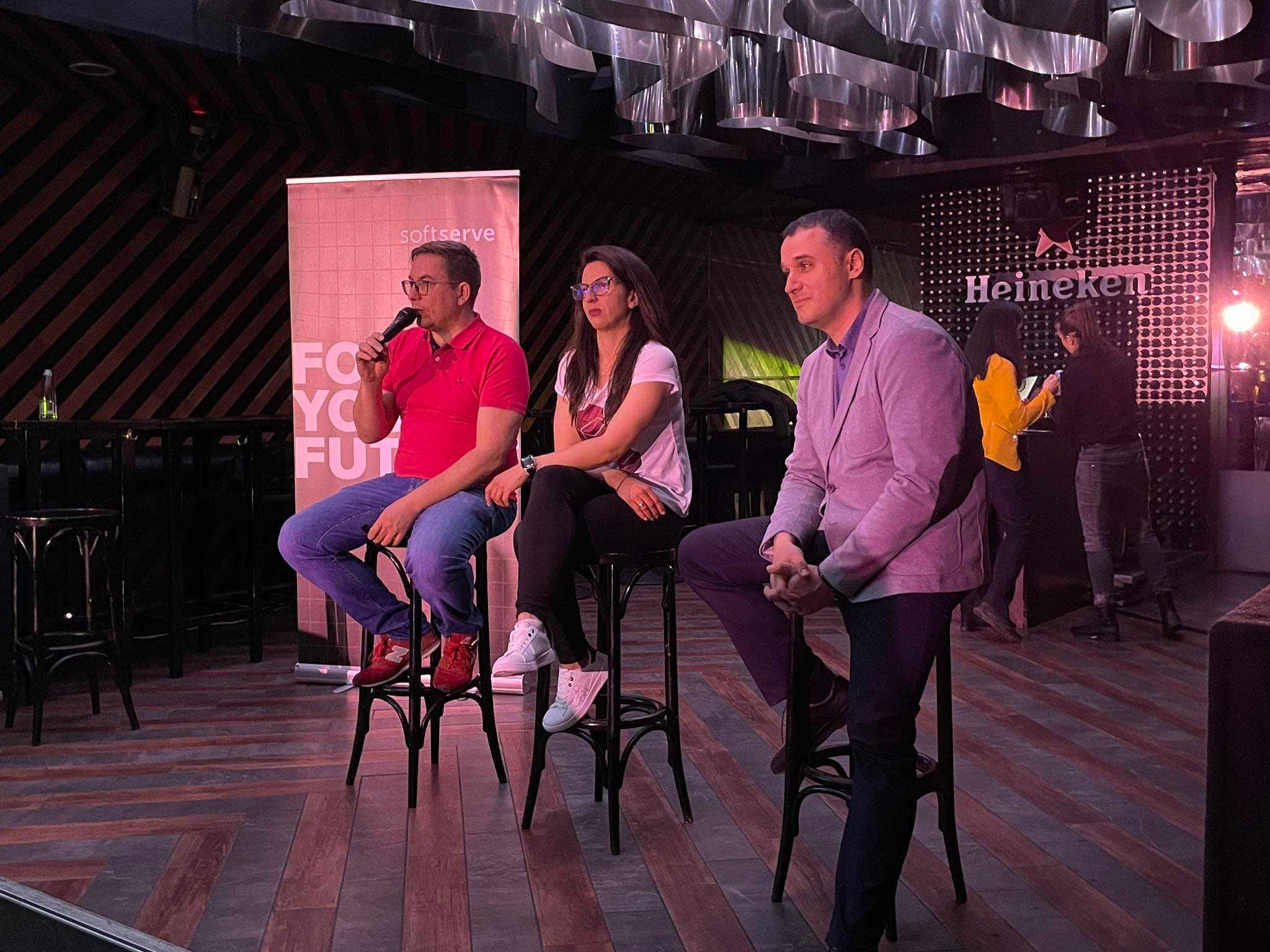
There was another event for digital product geeks in Sofia last week. Part of my contributing back to the community that helped me tremendously in my career. During this ProductTank Sofia Community event, we got together in person, once again silently told COVID to go to hell, and talked about ethics and product innovation:
Dark patterns came up as a hot topic. The audience almost splashed their drinks at some of the speakers as part of the entertainment for the night was in the form of a pre-agreed, scripted fireside chat. We made the script informative but also rather provocative. I argued in favor of using an ethical approach to product management while Ivan Yosifov contended that profit rules them all. Yana Neykova was in the middle of this storm trying to reason with us. At one point a kitchen knife was used as a prop on stage. It was meant to demonstrate metaphorically that you can invent a product but the user decides how to use it (to feed or to hurt someone).
The point here is that you should definitely try to make more of our events. They make for some much-deserved entertainment after the work day.
Dark patterns are user interface design choices that intentionally deceive or manipulate users into taking certain actions that they may not have intended. Here are some examples of dark patterns in digital products:
Sneak into basket: A common tactic in e-commerce, where a product is added to the user's shopping cart without their consent or knowledge, often through deceptive language or hidden checkboxes. See the example below:

How many times would one click on the “More info” toggle to find out that one is also subscribing to marketing emails?
Forced action: This technique forces users to take an action they might not want to, such as sharing personal information, by making it the only available option or using manipulative language.
By far my favorite example of this pattern pops up every time there is a Windows update:

How about letting me shut down my PC without an update?
Roach motel: This is a technique used to trap users in a service or subscription by making it easy to sign up but difficult to cancel or unsubscribe. Example:

The same pattern is used to trick you into sharing more data than you need to:
Bait and switch: This is a technique used to mislead users about a product or service, often by showing them one thing and delivering something else. By far one of the most annoying features of Reddit is the cleverly disguised posts that lead you to an ad/subscription page:

Privacy zuckering: Named after Facebook founder Mark Zuckerberg, this technique is used to trick users into sharing more personal data than they would otherwise, often through confusing privacy settings or deceptive language. Example:
How many people go through the lengthy process of configuring Google’s data privacy settings?
Friend spam: This is a technique used by social networks to encourage users to invite their friends to join, often through aggressive or misleading notifications. Example:
How many of your contacts are already on LinkedIn or don’t want to be invited? In both cases, your action will result in spam. Also, what does “periodically import and store” mean?
Misdirection: This is a technique used to direct the user's attention away from the real action being taken, often through deceptive or confusing design elements. For example, this program asks you to provide an email to get a free report and register for “posts by email”:
You realize the catch when your inbox explodes and you find out that you’ve registered for 15 different types of newsletter/publication emails from the same publisher:
These are just a few examples of the many types of dark patterns found in digital products. Product designers and managers need to avoid using these tactics, as they can damage user trust and lead to negative brand associations (i.e. don’t be an asshole to your product users).
Instead, design with transparency, clarity, and user-centeredness in mind. Your product will survive longer.